Search
Logo usage
The core element in ProCredit’s corporate design is the logo. The logo always remains the same in terms of form and proportions, and must never be modified.
Basic rules for the logo:
It should always appear against a white or light grey background. Add here: (values up to R: 230, G: 230, B: 230).
On the website, or web applications the logo appears in the top left corner.
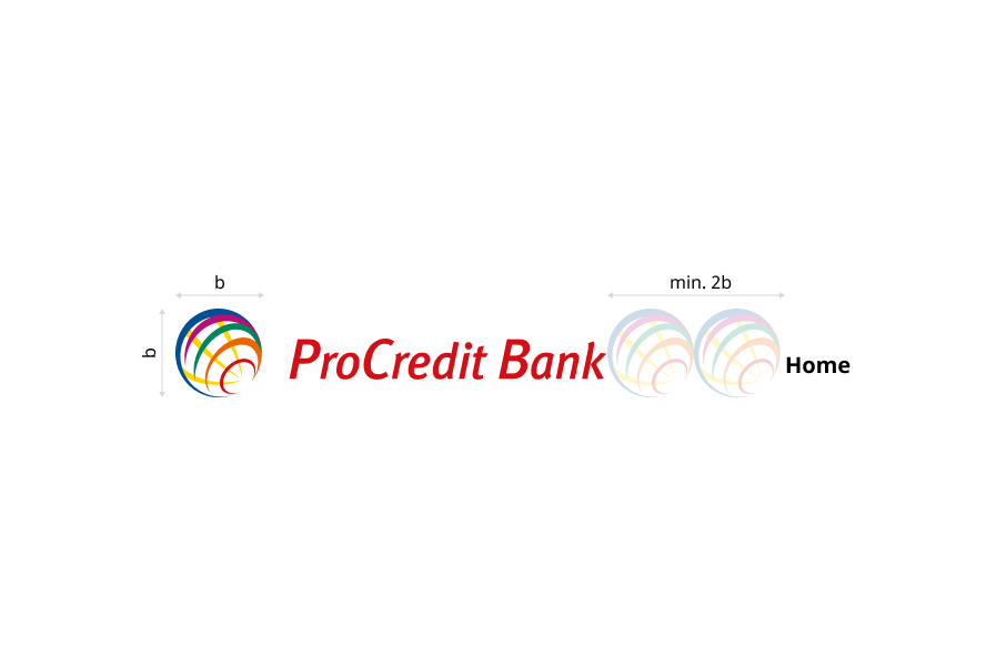
The amount of space needed for the logo is proportional to the size of the logo you wish to use. For more details, please see Clear space part below.
Logo source files
Download
Download
The globe alone can be used as an icon in elements like tabs or buttons. It should be always placed against white or light gray (values up to R: 230, G: 230, B: 230) background.
It can’t be used as a replacement for the full logo. Full logo must always appear in the applications or on the website, as a part of the main layout.
See part
It can’t be used as a replacement for the full logo. Full logo must always appear in the applications or on the website, as a part of the main layout.
See part
The logo exists also as a square version. This logo can be used only in exceptional cases, after approval from the Group Communications Team. In case you need this logo you can contact Group Communications Team.
General composition of the logo versions
Optical kerning, refined weight, and defined clear space, as well as well delineated placement in relation to other content all help to make it as instantly recognizable as possible at all sizes and in all contexts.
Clearspace
Optical kerning, refined weight, and defined clear space, as well as well delineated placement in relation to other content all help to make it as instantly recognizable as possible at all sizes and in all contexts.
Minimum padding creation

How to use the globe
The globe can be used as a favicon (browser icon).
In this case it should appear against a transparent background only.
In this case it should appear against a transparent background only.
Loading screen examples
The full colour globe on white or light grey background may be used in load or intro pages, only if full ProCredit logo appears later in the app.
Log in screen
Regular logo
Logo guidance
Optical kerning, refined weight, and defined clear space, as well as well delineated placement in relation to other content all help to make it as instantly recognizable as possible at all sizes and in all contexts.
Don’t change the size or rearrange any elements of the logo. The logo must always keep the same proportions.
Don’t place the full-colour logo against a coloured background. Use neutral, light grey backgrounds (up to 15% black) which do not hamper legibility.
Logo should never be used in black colour.
White logo should not be used.
Don’t change the font or font colour.
Don’t distort, stretch or compress the logo. (If you want to resize the logo proportionately, hold down the “Shift” key on the keyboard.)
Don’t change the colour of the logo. The logo may only be used in full colour.
Don’t use the space below the logo for slogans or other messages.
Don’t combine the logo or the globe with any additional elements.
The usage of the globe alone is restricted please see part Globe. Do not combine the globe with any additional elements.